
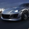
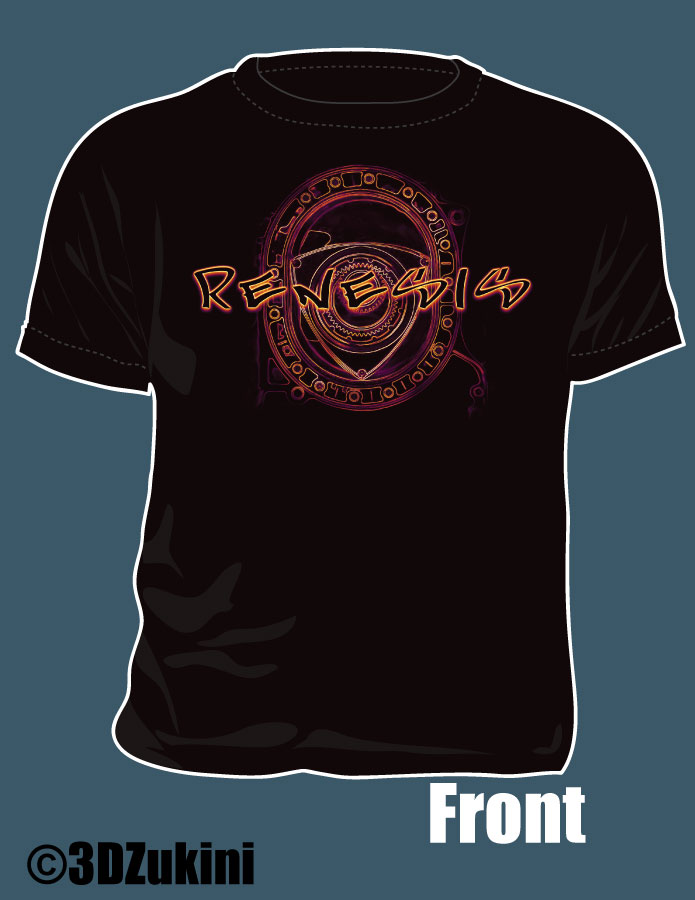
Rx8 T-shirt idea

whines all the way home
iTrader: (2)
Joined: Oct 2004
Posts: 7,402
Likes: 2
From: Towson/Baltimore, MD
WWWWWWWHHHHHHHHAAAAAAAAATTTTTTTTTT?! how do i do that?!!?!
rotr8 - looks good, i like that a lot. that, with just the rotor on the front chest would be perfect. i like it best w/o any writing too.
i STILL think we should have the ms8 on there...that front and side skirts would make it look nice!
rotr8 - looks good, i like that a lot. that, with just the rotor on the front chest would be perfect. i like it best w/o any writing too.
i STILL think we should have the ms8 on there...that front and side skirts would make it look nice!
Stone him!!!!!!


Never fear, Jedi is here!!
After skimming through the thread, here is what I think would look best together.
Go with this front, the font it awesome and then use Rotor8's idea for the back of the shirt.
You could also make a 2nd run of shirts with the girl on it for those that prefer that.
It's a win-win for everyone!
After skimming through the thread, here is what I think would look best together.
Go with this front, the font it awesome and then use Rotor8's idea for the back of the shirt.
You could also make a 2nd run of shirts with the girl on it for those that prefer that.
It's a win-win for everyone!


Registered
Joined: Apr 2006
Posts: 5,027
Likes: 0
From: Austin, Texas
Never fear, Jedi is here!!
After skimming through the thread, here is what I think would look best together.
Go with this front, the font it awesome and then use Rotor8's idea for the back of the shirt.
You could also make a 2nd run of shirts with the girl on it for those that prefer that.
It's a win-win for everyone!
After skimming through the thread, here is what I think would look best together.
Go with this front, the font it awesome and then use Rotor8's idea for the back of the shirt.
You could also make a 2nd run of shirts with the girl on it for those that prefer that.
It's a win-win for everyone!
swweeet, now when can i buy one

no offense but the font choice on the front would prevent me from buying that shirt. its just a little closer than i wanna get to beating Johnny Tran at Race Wars. just my opinion
Cool, I can lay one out like that pretty easy. I actually like simpler also, I just made a guess on what style of car shirt you all would like... I'm going to go with whatever sells the most shirts 
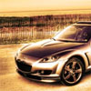
I could paint on the MS front and sides, but not sure if that would make more or less people want to buy it. Probably more 8 owners out there with the stock setup and might like it to look like their car... I love the MS front and I want one for myself someday
I could paint on the MS front and sides, but not sure if that would make more or less people want to buy it. Probably more 8 owners out there with the stock setup and might like it to look like their car... I love the MS front and I want one for myself someday
Registered
Joined: Apr 2006
Posts: 5,027
Likes: 0
From: Austin, Texas
can use this font instead?

or what ever font taht zoo york is using
I just notice, the font u use @3dzukni will be nice also.
Last edited by alfy28; Mar 19, 2009 at 12:32 PM.

Registered
Joined: Apr 2006
Posts: 5,027
Likes: 0
From: Austin, Texas
i never liked our badge font. i always tihnk it looks very 80'ish. reminds me of a font that American Ninja poster would of had.

Registered
Joined: Apr 2006
Posts: 5,027
Likes: 0
From: Austin, Texas
^^ i think 3d is going to get tired of me lol. i guess the more i look at it, the more the font feels out of place. if the rotary was drawn in cartoon style i can see the font being perfect for it. but since its drawn with seriousness, the font doesnt fit well. but that is just me.
its like i wear a clean looking tux to a wedding, but i decided to wear bright neon pink shoes. not that its that loud. but that is what it reminds me of.
so i feel the font should be more consertative. but if me, i wouldnt have a font on there. the rotary it self is perfect.
its like i wear a clean looking tux to a wedding, but i decided to wear bright neon pink shoes. not that its that loud. but that is what it reminds me of.
so i feel the font should be more consertative. but if me, i wouldnt have a font on there. the rotary it self is perfect.
Last edited by alfy28; Mar 19, 2009 at 12:54 PM.


yeah the characters are all slanted and off-balance
couldnt have said it better. ill check my catalog of fonts when i get back from class to see if we can convert the club. if not, then so be it
^^ i think 3d is going to get tired of me lol. i guess the more i look at it, the more the font feels out of place. if the rotary was drawn in cartoon style i can see the font being perfect for it. but since its drawn with seriousness, the font doesnt fit well. but that is just me.
its like i wear a clean looking tux to a wedding, but i decided to wear bright neon pink shoes. not that its that loud. but that is what it reminds me of.
so i feel the font should be more consertative. but if me, i wouldnt have a font on there. the rotary it self is perfect.
its like i wear a clean looking tux to a wedding, but i decided to wear bright neon pink shoes. not that its that loud. but that is what it reminds me of.
so i feel the font should be more consertative. but if me, i wouldnt have a font on there. the rotary it self is perfect.
It's actually a cheesy font directly based off of the Need for Speed games, not my style either.... to be honest, I don't think I own any car shirts  I'm more of an Ed Hardy kind of guy, not the new crazy busy Ed Hardy stuff, the simpler ones when it was cool.
Last edited by 3DZukini; Mar 19, 2009 at 02:05 PM.

