


"illest" emblem


"illest" emblem
i made it said "illest8" lemme know what you guys think
i know it looks like the "illest" and the "8" are 2 different fonts but in person its not that noticable
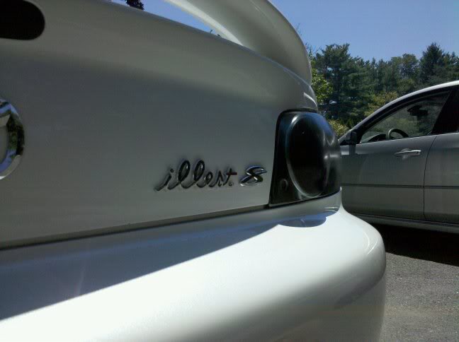
i know it looks like the "illest" and the "8" are 2 different fonts but in person its not that noticable





It's alive and kicking -> http://fatlace.3dcartstores.com/Illest_c_27.html





Registered Paratrooper
Joined: Apr 2008
Posts: 403
Likes: 0
From: Fort Bragg, North Carolina
"illest" is stupid. I think people throwing it on their car is even more stupid.
You should replace it with "RX-". That would look the "illest" in my opinion.
Ryan
You should replace it with "RX-". That would look the "illest" in my opinion.
Ryan
Last edited by Ryan2008; Jul 10, 2010 at 04:01 AM.






Eminem, I think the general idea getting thrown around is take it off
On a side note, I am ordering "I'm one of the baddest motha ****** of all times" in the cursive writing and putting it on my trunk
On a side note, I am ordering "I'm one of the baddest motha ****** of all times" in the cursive writing and putting it on my trunk

