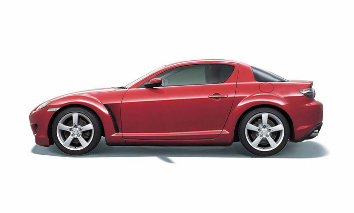

Rx8 coupe concept


Thread Starter
Registered User
Joined: Jul 2006
Posts: 8
Likes: 0
Rx8 coupe concept
Hello everybody this is my first post.
Its a couple of chops on the rx8 from Marcos Acosta
for a bit of fun.
I tried to use some chrome finishes to break up the
monotone colour look and also make it more retro
I believe the coupe should be 2-3 inches lower and 3-4 wider
Ive tucked up the rear and on v3 tried to use the reverse curves
of the door window for the front wheel rear air openings and
similar angles througout. There is a front scoop that can be
fluted but air has to travel away from engine bay and
guards have been blended instead of hard angled.
and just wanted to see your views? and also would this
shape lend itself better for a convertible?
I plan to do the front and rear views but will take much longer
with the following.......
Recessed (25 cm further back than original a-la-audi 04 lemans car?)
Rotor shaped grill with chrome surround,
elongated rotor healights and tailights.
Bonnet fluted with opening facing the windscreen
Rotor shaped side mirrors (already pictured)
Rotor shaped driving lights
Large single rotor shaped exhaust outlet where bottom rotor reverse stop light is
any other ideas let me know
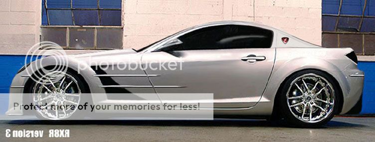
I prefer v3 as its steers away from the korean/jap/chinese cheap look of the roof and rear window to more classical lines.
The biggest problem is that Mazdas latest designs date way to quickly not like a porsche 356 / corvette / mustang etc.
regards, d.
Its a couple of chops on the rx8 from Marcos Acosta
for a bit of fun.
I tried to use some chrome finishes to break up the
monotone colour look and also make it more retro
I believe the coupe should be 2-3 inches lower and 3-4 wider
Ive tucked up the rear and on v3 tried to use the reverse curves
of the door window for the front wheel rear air openings and
similar angles througout. There is a front scoop that can be
fluted but air has to travel away from engine bay and
guards have been blended instead of hard angled.
and just wanted to see your views? and also would this
shape lend itself better for a convertible?
I plan to do the front and rear views but will take much longer
with the following.......
Recessed (25 cm further back than original a-la-audi 04 lemans car?)
Rotor shaped grill with chrome surround,
elongated rotor healights and tailights.
Bonnet fluted with opening facing the windscreen
Rotor shaped side mirrors (already pictured)
Rotor shaped driving lights
Large single rotor shaped exhaust outlet where bottom rotor reverse stop light is
any other ideas let me know
I prefer v3 as its steers away from the korean/jap/chinese cheap look of the roof and rear window to more classical lines.
The biggest problem is that Mazdas latest designs date way to quickly not like a porsche 356 / corvette / mustang etc.
regards, d.
Last edited by d1k; Sep 24, 2007 at 08:48 PM.


Originally Posted by Titanium_Eight
It looks Photoshopped.

Hence:
Its a couple of chops on the rx8 from Marcos Acosta
for a bit of fun.
I tried to use some chrome finishes
for a bit of fun.
I tried to use some chrome finishes

jersey fresh
Joined: Dec 2005
Posts: 3,688
Likes: 0
From: Boston, MA
i kinda like it, concept lookin, reminds me of the concept viper with that long hood or even the mercedes SLR. Try shorting up the front some and see how it flows (shortin the space between the front wheels and the doors.)


Registered
Joined: Oct 2005
Posts: 939
Likes: 28
From: Port Royal, SC
Wow, very cool IMO but looks like it should cost about 5-7 times as much as a fully loaded 8. I love the fender strakes. But about all these rotor symbols. Don't you think the 8 already has enough of them? rotary accents, headrests, hood, shifter, plus the ton of aftermarket options of rotors: all the ones under the hood(oil, washer fluid,etc), valve stem caps, pettit radio **** (which also says rx8 on it) wheel centers (which also say rx8 on them) B pillers, which say rx8, MAZDASPEED, or have the rotary symbol(then I think they say rx8, can't quite remember, the start button is rotor shaped, and the big rotor stickers. But, maybe it need some more. Still, I think it is very cool. And it is silver which makes it even better.
Thread Starter
Registered User
Joined: Jul 2006
Posts: 8
Likes: 0
When I mean wider it will definately not make it heavier in terms of amped up guards and shorter body. 
Minus 2 doors will save a bunch also and the all alloy rotor will help too
For your comparos. Looks at the lines closely

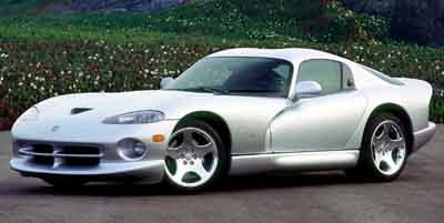
couldnt find a better side shot of the viper in silver.
Minus 2 doors will save a bunch also and the all alloy rotor will help too
For your comparos. Looks at the lines closely
couldnt find a better side shot of the viper in silver.
Thread Starter
Registered User
Joined: Jul 2006
Posts: 8
Likes: 0
Originally Posted by t-run/8
Wow, very cool IMO but looks like it should cost about 5-7 times as much as a fully loaded 8. I love the fender strakes. But about all these rotor symbols. Don't you think the 8 already has enough of them? rotary accents, headrests, hood, shifter, plus the ton of aftermarket options of rotors: all the ones under the hood(oil, washer fluid,etc), valve stem caps, pettit radio **** (which also says rx8 on it) wheel centers (which also say rx8 on them) B pillers, which say rx8, MAZDASPEED, or have the rotary symbol(then I think they say rx8, can't quite remember, the start button is rotor shaped, and the big rotor stickers. But, maybe it need some more. Still, I think it is very cool. And it is silver which makes it even better.
You are absolutely right on!!! but thas the challenge
The hardest thing is to make sure its not overdone or tacky.

The biggest problem is that many have forgotten what a rotor is outside us freaks.


Administrator
Joined: Jul 2002
Posts: 21,958
Likes: 115
From: portland oregon
took me a while but when dillsrotary said concept viper i remembered...
it looks like the chrysler FIREPOWER concept
http://www.allpar.com/cars/concepts/firepower.html

it looks like the chrysler FIREPOWER concept
http://www.allpar.com/cars/concepts/firepower.html
Thread Starter
Registered User
Joined: Jul 2006
Posts: 8
Likes: 0
Originally Posted by NgoRX8
yea... right when i saw that chop it looked like the slr. hahah
can you say strakes galore? hahah
can you say strakes galore? hahah
Yeah its different but easy to confuse when you dont often see any of the two on the road

However about the cost... compared to yesteryears investements it should be a piece of cake for mazda to do it and the alloy endplates for the renesis.

The mopar concept looks like a reshuffle of the old bmw z8
Last edited by d1k; Jul 17, 2006 at 11:45 PM.


Thread Starter
Registered User
Joined: Jul 2006
Posts: 8
Likes: 0
2 strakes on the side and the rest are chrome trims
The strakes are like flat plates of chrome that start wide inside the side scoop and then fade as the get to the door into flat trims. The front and rear matching trims breaks up the expansive monotone-ness that most under 40,000 dollar cars have (and playstation and other game generated cars have also that youngster grow up with). Cars of the 60s and 70s used to have plenty of chrome but I guess most owners of 40K cars are where never around the 60s or owned early retros.
The main problem with many of todays cars not appreciating is the all plastic look.
Thread Starter
Registered User
Joined: Jul 2006
Posts: 8
Likes: 0
Originally Posted by SayNoToPistons
needs more even flows... take away the aggressive sharp lines.
You have too be a little be more especific to so I can picture what you mean
If you look closely the tailights flow with the rear of the roof line,
the side scoop creates an arrow head with the side window angle,
the top of the side mirror flows with the roof lines,
the guards are blended to the top of the bonnet plane,
The rear of the front wheel arch is parallel to the front of door and then flow out away from each other
The front scoop will angle with the bonnet plane and front wheel arch
There are a few design principles I adhered to in order to create aggression and flow unlike the Merc which is overdone to the point where the front of the mirror was just filled in, the mirror doesnt suit anything and rear of side door windows has the wrong vertical post stopping flow etc.
I followed the rotor emblem`s shaped which is curved and sharp at the same time.

Originally Posted by d1k
You have too be a little be more especific to so I can picture what you mean
If you look closely the tailights flow with the rear of the roof line,
the side scoop creates an arrow head with the side window angle,
the top of the side mirror flows with the roof lines,
the guards are blended to the top of the bonnet plane,
The rear of the front wheel arch is parallel to the front of door and then flow out away from each other
The front scoop will angle with the bonnet plane and front wheel arch
There are a few design principles I adhered to in order to create aggression and flow unlike the Merc which is overdone to the point where the front of the mirror was just filled in, the mirror doesnt suit anything and rear of side door windows has the wrong vertical post stopping flow etc.
I followed the rotor emblem`s shaped which is curved and sharp at the same time.

Last edited by SayNoToPistons; Jul 20, 2006 at 05:32 PM.
Thread Starter
Registered User
Joined: Jul 2006
Posts: 8
Likes: 0
It looks completely overdone plastic and outdated.
The compromise mazda makes is by designing cars that appeal to
the asians and some in the american markets which love overdone
curves and overdone everything.
Look at the new mustang it has nothing over a 60s one.
American designers need to go back to the 60s but keep it simple rather than tacky as they done so far by adding 90s touches to the 60s reincarnations.
More and more cars designed today are outdated very quickly.
The only cars that maintain their appeal unfortunately at the
moment are French cars but they are mostly FWD!!!.
The strakes are hard on the eyes of ricers who prefer plastic.
Last edited by d1k; Sep 24, 2007 at 08:47 PM. Reason: Main error of FWD not RWD and clarifying retro designers mistakes
Originally Posted by d1k
It looks completely plastic and outdated except for the roof line
it still has one of the best rooflines available.
The compromise mazda makes is by designing cars that appeal to
the "majority not all" asian and american markets which love overdone
curves and overdone finishing.
Looks whats coming out of Daimler/Chrysler, Ford and Chev.
Look at the new mustang it has nothing over a 60s one.
American designers need to go back to the 60s and stay away
from adding 90s touches to the 60s reincarnations.
More and more cars designed today are outdated very quickly.
The only cars that maintain their appeal unfortunately at the
moment are european cars but they are mostly RWD!!!.
The strakes are hard on the eyes of many americans but so far
in France I had nothing but praise.
Maybe more people should post their "chops" to show their preference