
View Poll Results: Choose a logo you like best


Multiple Choice Poll. Voters: 110. You may not vote on this poll
Vote on our new logo design


Thread Starter
Thews8
Joined: Apr 2004
Posts: 2,535
Likes: 11
From: Oregon South Coast
Vote on our new logo design
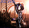
I need some help here.. Please vote on the logos you see here.. let me know what you think and what you like better and why..
Thanks
wait for all 3
Thanks
wait for all 3
Last edited by thew; Feb 15, 2005 at 02:05 PM.

RX8 and a Truk....
Joined: Nov 2004
Posts: 4,658
Likes: 7
From: OKC
I hate...I mean I HATE picking apart somebody's work...The first two designs look awesome...
But... And again, realize I hate this sorta thing...
the first two are too busy...the name gets lost in the banner...imo.
But... And again, realize I hate this sorta thing...
the first two are too busy...the name gets lost in the banner...imo.

RX8 and a Truk....
Joined: Nov 2004
Posts: 4,658
Likes: 7
From: OKC
:D

I'd also remove the word 'of' in the text below, and make it stand out more..maybe use white 'stroke' feature...??? Change 'Your Source' to 'The Source'....
Or "Your source for Mazda Performance Needs..."
my $.02.
I'd also remove the word 'of' in the text below, and make it stand out more..maybe use white 'stroke' feature...??? Change 'Your Source' to 'The Source'....
Or "Your source for Mazda Performance Needs..."
my $.02.

Screw gas mileage
Joined: Oct 2004
Posts: 2,179
Likes: 1
From: Marlton, NJ
I'd say first, the second one's rather busy, and maybe change the font like TXRX8 said. Very nice work though. It also makes a difference as to whether you're planning a light background or a dark background for your site


Registered
Joined: Dec 2004
Posts: 170
Likes: 0
From: O'Fallon, MO
If you're going to use this for a business you might want to find out if those images you made the logo from are copyrighted first. If so, I'm sure you can find someone on here that would provide you with some nice, professional quality images (dmp).
Originally Posted by WaterLogged
If you're going to use this for a business you might want to find out if those images you made the logo from are copyrighted first. If so, I'm sure you can find someone on here that would provide you with some nice, professional quality images (dmp).

You do realize you just insulted me.
Last edited by PoLaK; Feb 15, 2005 at 05:41 PM.


Registered User
Joined: Sep 2004
Posts: 4,887
Likes: 2
#3 is kind of bland
#2 hurts my eyes with all the crazy stuff in the middle
#1 looks good, but the pier seems kind of weird for a performance car parts ad, maybe a windy road or something.
I picked 1 anyways, my favourite of the bunch
#2 hurts my eyes with all the crazy stuff in the middle
#1 looks good, but the pier seems kind of weird for a performance car parts ad, maybe a windy road or something.
I picked 1 anyways, my favourite of the bunch


Registered
Joined: Oct 2001
Posts: 7,966
Likes: 4
From: Boulder County, Colorado
You can't go wrong with either of the first two, but I voted for number one. I definitely like the simpler better, IMHO... but I might add some slowly animated subtle text along the bottom covering what models you do - plus animated gifs get more attention.


Lawyer in training :)
Joined: Aug 2004
Posts: 913
Likes: 0
From: Atlanta, GA
Originally Posted by dmp
:D
I'd also remove the word 'of' in the text below, and make it stand out more..maybe use white 'stroke' feature...??? Change 'Your Source' to 'The Source'....
Or "Your source for Mazda Performance Needs..."
my $.02.
I'd also remove the word 'of' in the text below, and make it stand out more..maybe use white 'stroke' feature...??? Change 'Your Source' to 'The Source'....
Or "Your source for Mazda Performance Needs..."
my $.02.
I agree with dmp's critique--lose the "of" especially and you're good to go. I also didn't see the relevance of the pier in the first pic. Doesn't seem to make sense to me. So I went with #2.
Registered User
Joined: Mar 2004
Posts: 613
Likes: 0
From: Phoenix, AZ
#1 for sure - #2 is entirely too busy. #1 I love the liquid look of the car, it ties in wonderfully with the pier & water or beach, and #1 is very clean. I agree w/the verbiage recommendations made as well.
Dayum nice work. I am impressed.
Dayum nice work. I am impressed.

Registered
Joined: Feb 2004
Posts: 744
Likes: 0
From: San Diego, Ca
Please take this as constructive criticism coming from a fellow designer, my wife frequently plays devils advocate/gives me reality checks for my work.
I think number two is an interesting style, one similar to what I've used in the past, but does not work for a logo like this. The layer behind the text is a bit busy making it a touch hard to read. A simple fix would be to either blur it, or reduce the contrast between the busy stuff and the layers behind.
That said, I'd go with number one, it looks cleaner and when trying to make an impact, simpler is frequently better.
Looks good, I like the style you're going for.
Last edited by Labop; Feb 15, 2005 at 08:12 PM.

Registered
Joined: Nov 2004
Posts: 4,866
Likes: 4
From: Buford, GA USA
The first two are too busy and the third one is too bland. If you want to use either of the first two you will need to make the background less busy. I've attached a VERY quick adjustment for you to see my suggestion. Hope you don't mind my chopping it up and stirring it around. It has clipping remnants in it so you will need to use it as a guide only.

