
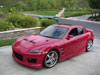
RX-8 AIM Theme


Thread Starter
Speeder
Joined: Aug 2003
Posts: 97
Likes: 0
From: Gainesville, FL
RX-8 AIM Theme
If you have AIM (AOL's instant messanger) then you can download this theme, tell me what you guys think.....
AIM THEME CLICK HERE
AIM THEME CLICK HERE

mostly harmless
Joined: Jun 2002
Posts: 3,440
Likes: 0
From: Greater Vancouver Area, BC
Originally posted by ZUMZUM_RX8
What can I do to make it better?
What can I do to make it better?

give it some space, flatten it out... it's really quite distracting to have stretched RX-8's ALL OVER the place... instead, try like an "RX-8" logo in the corner, and a black-to-blue gradient for the backgroun, with one large RX-8 sitting there, behind all the windows (actually, thinking about that, it'd probably be pretty impossible to get that perfect, huh??). um... so, yeah. it's cool that you made one, but revisions might help with the popularity.
rotor symbols (especially with the frequency at which they appear in the interior design of this car) are never a bad way to go
*wankel power*edit: hahaha!! i LOVE how you threw in the title graphic from the forum!! bravo :D
Caution!
Joined: Jul 2003
Posts: 207
Likes: 0
From: Michigan
Great effort ZUM. It is a good start.
Here are a few more suggestions in addition to Wakeech's. I created a picture to illustrate my examples a bit better. It is in the post below.
1) In the text box it is not a good idea to use dark colors or many different colors. This can make it very hard to read since the majority of people use darker colors to type with. Most people just use the standard black. Try using a Lighter color with a similar colored picture. Perhaps a Grey/Silverish background with either a large "Flying M", a large rotor symbol (like the rotor accents on the car) or perhaps the free hand drawn rotor symbol only in a silver/metallic color. Notice these pictures are all subtle and close to the background color I mentioned. This will make the picture a little harder to see but the text will be much clearer (Unless the person you are talking to is using grey...). After all you are soposed to be reading the text, not looking at the pictures.
2) Most pictures look better in thier correct orientation. This is an area where it can be tough to tell if it looks good or not. Try getting people's opinions and compare the different orientations directly to see which is the best.
Do not stretch pictures unless you keep them in the same ratio. See the example for clarification.
3) You have a blank spot here. Everywhere else there is stuff going on except here. It just grabs my attention and yanks it to this spot. Unfortunately, there is nothing there though to see. So it detracts from the whole. There are three options here. You can make more blank spots in other places by removing some of the pictures. This will make it look less busy and since you can't look at two spots at once you will be able to divide your attention evenly over the whole image. You could also fill it up. Do this if you are really going for the huge collage look. I made a whole wallpaper like this, it doesn't really look that good but I'll post it as an example if I find it. Lastly, you need a textured background, something other than the solid blue. If you create a blank spot that blends into the rest of the picture then its not really a blank spot any more is it?
Hope these tips help. You got a good thing goin there, I think it will be really cool when you finish.
-JiM
Last edited by j1mb0x99; Sep 26, 2003 at 08:58 AM.
Caution!
Joined: Jul 2003
Posts: 207
Likes: 0
From: Michigan
I added some notes too.
1) I created a simple beige example that might work well... not many people type in beige.
2) Which picture of the lovely Kate Beckinsale do you like better? This is a 25% reduction.
3) I replaced part of the light blue with the darkerblue from the forum. This way the picture seems to flow behind the buddy list instead of the list apearing to be isolated. Normally, the light blue would be completely replaced but I left some for a contrast.
--JiM
Last edited by j1mb0x99; Sep 26, 2003 at 09:00 AM.

Thread
Thread Starter
Forum
Replies
Last Post
Chapsy
RX-8's For Sale/Wanted
1
Sep 22, 2015 09:57 AM
Tsurugi
New Member Forum
0
Sep 7, 2015 08:27 PM