
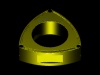
how does this look


Banned
Joined: Mar 2003
Posts: 3,535
Likes: 2
From: Gold Coast Australia
jhouse
Wow that is right on , as my sons would say sick as .
Hoping to make your rotary logo into our club symbol .however there are only 7 rx8 owners here on the goldcoast and i dont know them personally , so i may be the only member. ha ha ha
once again thanks
Michael.
Wow that is right on , as my sons would say sick as .
Hoping to make your rotary logo into our club symbol .however there are only 7 rx8 owners here on the goldcoast and i dont know them personally , so i may be the only member. ha ha ha
once again thanks
Michael.
Thread Starter
Registered User
Joined: Oct 2003
Posts: 182
Likes: 0
From: Idaho
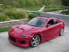
i just joined the local www.idahorotary.com car club.
thought i'd just mess around with a pic.
thought i'd just mess around with a pic.
Banned
Joined: Mar 2003
Posts: 3,535
Likes: 2
From: Gold Coast Australia
Jhouse
reading your profile i noticed you are not a well man (Addicted to octane ) dont woorry i have the same disease and have survived ,so far , but lately i find i am being attracted more and more to younger women and that disease can kill you, especially if my misses finds out.
My club will most likely be really exclusive only poor little old me and the rest will all be rx8 female test pilots .
RX8 nirvana .
How many rx8 members in your club ???
maybe the goldcoast and idaho can become sister rx8 clubs?
On another note can you tell me how to post the logo on the australian site or maybe you can do that for me , but make sure you take all the kudos you are a talented man , my computer skills suck.
thanks michael.
CHAH-LAY MURPHAAAAAY!
Joined: Feb 2003
Posts: 205
Likes: 0
From: los angeles, ca (i'm from chicago)
not bad jhouse!
one critique (i learned this a long time ago in typography class at art school):
never use all caps with 'script' fonts (ie. fonts that look like hand writing or have embellished serifs). it looks tacky and actually hinders readability.
- mike
one critique (i learned this a long time ago in typography class at art school):
never use all caps with 'script' fonts (ie. fonts that look like hand writing or have embellished serifs). it looks tacky and actually hinders readability.
- mike
CHAH-LAY MURPHAAAAAY!
Joined: Feb 2003
Posts: 205
Likes: 0
From: los angeles, ca (i'm from chicago)
none taken jhouse.
i said don't use all caps with script fonts. if u weren't using a script font, or better still, a san serif font (ie. Impact, Verdana, Arial) it would look better and read easier (in mine, and many other graphic designer's opinions).
of course, do what u want. i was just sharing what i learned as one of the "rules of thumb" in "typography and design 101."
Registered User
Joined: Oct 2003
Posts: 63
Likes: 0
From: Birmingham, UK
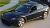
Originally posted by Jhouse
i just joined the local www.idahorotary.com car club.
thought i'd just mess around with a pic.
i just joined the local www.idahorotary.com car club.
thought i'd just mess around with a pic.

